Friday, November 11, 2011

Neil - completed!

Well, I'm finished.

From my last post (Progress 6) there has been about 4 or 5 more hours work on the face, building up the shading to the darkness I was after. What took the longest were subtle changes that needed to take place in the shape of the nose, eyes and mouth. Things that may seem insignificant, but that make all the difference in the final product.


Have a look at the below comparison - the one on the right is the finished product.


I spent about an hour or two working on this upside down. You would be suprised what you see when looking upside down, that for some reason you never notice normally.


This next photo is a zoomed in version of the detail of the eye and wrinkles. Probably about 75% is achieved using the paper stump to smudge, and the rest directly with pencil.

It's been surprising how much the wrinkles have made this drawing so enjoyable.


Thursday, November 3, 2011

Neil - Progress 6

This will be my second last scan of this image.
It's pretty much done, but I want to do a final check and bring out the darks a little more, then erase the frame, clean up any bits and pieces, and then that's it.
I'm very happy with how it's gone.


Wednesday, November 2, 2011

Neil - Progress 5

Nearly there!
I've darkened the skin tones a few more times since the last scan, as well specific places on the nose, ears and eyes.
A few more hours to go...


Neil - Progress 4

Hair always presents a great challenge. For some reason I find light coloured hair more difficult than dark.
It's very enjoyable working out how to shade hair. Often I find myself discontent with the results until I step back and look at the whole picture.


Neil - Progress 3


Neil - Progress 2


Tuesday, November 1, 2011

Neil - Progress 1

From the outset, this was the whole idea behind this blog - to allow people to see the progress of the portrait they have asked to be drawn.

It also gives me a chance to talk about my thinking and my drawing process.

To start with I draw the rectangle that frames the picture.

Although it seems insignificant, this rectangle is THE most important component of completing the outline.

On the reference photo this frame is the edge of the photo.
It is how I measure various points of the outline, with both a vertical and horizontal measurement.
Each point measured is then joined to another point, just like a dot-to-dot, slowly forming the outline.

The photo below may not be very clear as it is a light outline done lightly with a HB pacer.


Once I get the basic outline done I then work at the major facial features.


Next, each section of shading is also outlined - each light and dark area.
It is at this stage that the picture looks slightly freaky, as it isn't clear what areas will with be dark or light. It almost has that negative image thing happening.


Once I'm completely (and I mean completely) satisfied with the outline, it is only then that I begin the shading. If the outline is correct, it doesn't matter how well I shade, it will not resemble the person I'm drawing.

At this stage I usually breathe a sigh of relief because I realise that it will all turn out okay - yes, the finished outline stage freaks me out that much!


From here we just continue on, usually working from top to bottom, left to right.
This particular picture contains the darkest skin tones that I've ever worked with, and it's pushing my limits on what I believe my little HB pacer can do!
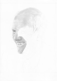


At this stage I'm building up the graphite, layer upon layer, getting just the right tone I'm after.
This can take time, and is often deceiving. I'm sure I'll go over this section a number of times more before I'm completely happy with it.

Okay... back to the drawing board I go!


Saturday, October 22, 2011

Capturing the moment

This photo captures the nature of the child perfectly - the cheeky smile, the glint in the eyes.
When I first had this photo sent to me I knew it would turn out well.

The drawing is one of three portaits - a gift for a good friend, who has had them framed beautifully. It's one thing to see your drawing the moment it's finished, it's quite another thing to see it matted and framed.

A challenge in this particular drawing was the lighting. In fact the two other portraits that accompany this one were inside when their photo was taken. This one is outside.
It was very difficult to know when to stop building up the shading on the neck. The contrast between the neck and forehead seemed to great, so I may have stopped a little too soon - either than, or didn't shade the forehead and lighter parts of the face enough.

This was my first attempt at short spiky hair.
I was really unsure how to go about it. That is one of my favourite aspects of drawing - having no clue whatsoever how to make something look realistic, and experimenting until it works.

In the end I did some solid shading on all of the hair. When I was happy with the darkness of it I began with my kneadable eraser and electric eraser to lift out the graphite just where the spiky bits needed to be.


Oscar

One of the darkest pictures I've drawn. I'm quite amazed at what an HB lead can acheive.

In the reference photo Oscar was lying on a bed of straw - so I feel I copped out somewhat in just drawing a smudged grey surface!

Oscar's chest and legs took quite a long time, as I really wanted the correct effect (hey, that rhymes!) of the direction of the fur and changing of one colour to the next. I also concentrated on individual stands of hair, not just a mass of solid colour.

The original photo was taken with a flash. Hence the ligher parts of Oscar's face actually are darker hairs reflecting the light from the camera. His face is dark brown and black, but that is not how it appears in the drawing due to this. In future drawings I will have to be careful of this - the pitfalls of greyscaling and grey lead pencil drawing!

The outlining of Oscar was a big challenge. His right ear was full of very obscure shapes that made no sense whatsoever.

With just about all my drawings, the outline always looks out of place, or on the weird side - until the shading is complete and you can step back and see why the outlining was the way it was after all. It's a good feeling.

Monday, October 10, 2011

Details, details...

It's amazing how hard work often pays off.

After drawing this picture, I have had second thoughts about any reference photo with highly detailed clothing.
But when I look at this picture its the stripy jumper that makes this picture so spectacular - the folds in the fabric, the fine details.

This was one of those pictures where I thought I had finished. The background was completed, every stripe accounted for (*phew!*), but comparing my drawing to the reference photo, I noticed that there was something amiss in the eyes.

Double checking, I discovered that the pupils were about 1mm smaller than what they should be.
Something so small, I thought, won't matter - I'll leave it.
But I couldn't just leave it there. After making the change, everything snapped into proportion a whole lot better.

Amazing how the details are so important.

I was surprised at how much shading (and dark shading at that) I had to do with her blond hair - in looking at the top of her head, there is more dark than light.

Out of all of my portaits that I've drawn, this has been the one that has taken the longest.
It's also the drawing that I've found the most difficult to part with - knowing how much was put into it.

Friday, October 7, 2011

Princess

When I told my sister-in-law that I'd draw a picture of her choice for her birthday, I had a sneaking suspicion it would be Princess, her dog.
I was feeling a bit nervous about this, as drawing people had been my only focus up to this stage.


The fear is that there is just so much fur and hair, how can I possibly do it all.

What makes the face of an animal (especially a very furry one like Princess) easier than a person is that if some of the fur is out of place, or the shading isn't 100%, or whatever - it really isn't going to make that much of a difference. Whereas if I was drawing a person and drew the nose off centre, or shaded the cheek incorrectly, the whole face may not be recognisable.

A challenge with this particular reference photo was that Princesses face was in perfect focus, but the rest of her was out of focus.

I had absolutely no idea how to draw something that is blurry. Do I just squint and give it my best shot?

I soon found that if I applied the same method of "draw what you see", it all turned out fine.

Tuesday, October 4, 2011

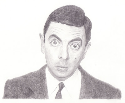
Mr Bean

Drawing the way I do is a matter of zooming in and getting every line in the right spot, every shade correct in relation to every other shade, working from whole to part and part to whole.

Sometimes I wonder if it can actually be classified 'art' when I'm essentially copying another picture, without putting my spin or interpretation on it. Hmm...

It's amazing how lost in a drawing I can become. Our clock on the mantle piece dongs every half hour and hour - it seems that only five minutes goes by and the clock is at it again.

In starting out my venture of drawing, I made sure that I used a range of pencil hardnesses - 6H, to F, all the way to a 9B.

Something interesting has taken place and I'm not quite sure how I feel about it...

I've abandoned all of the above pencils, and now use only one:
It's a Papermate Pacer with 0.5mm HB leads.
When I first completed the picture of Mr Bean below, I was quite surprised at the range of shades I could achieve with just an HB pencil.


Granted, I can't get the same dark as an 8B or 9B, but it's not bad. I have found that with a 6B or above there is often a shine in the graphite at various angles. With the pacer there is none. 

I enjoyed drawing this picture very much, although his tweed jacket had me pulling my hair out. I just couldn't get the exact effect that I wanted. In the reference photo, portions of the jacket were out of focus, or seemingly inconsistent with the shade beside it. I resigned myself to the thought that good enough was going to have to be good enough.

What's funny is that when I finished the drawing, the one thing most people pointed out what how realistic they thought the jacket looked.

Something is not right...

Here is a drawing I did in 2007.
If you were to choose one thing that struck you as out of place, or not so realistic, what would it be?

It seems quite funny now, picturing me holding a fork with my left hand - keeping as still as I could - all the while trying to outline and shade the picture with my right hand! Not an easy task.

Once again, this method is where I covered the whole page with graphite and erased to achieve the lighter shades and white.

Now back to my initial question: what is out of place? What makes this picture defy realism?
By this stage I had learnt a lot about drawing what I see, but I hadn't yet caught on to the fact that solid lines are few and far between on basically anything you look at.

Look at the outlines of the fingers and finger nails. The dark lines define the shape of the hand well enough, but in real life - they're just not there!

The trick is to either get rid of the line all together, and have two different shades meet, or shade up to the line, thus eradicating it.

Four months of practice

Below are two pictures drawn from the same reference photo, four months apart.
Note the subtle differences - the detail that for some reason I didn't 'see' the first time I drew: the intricacies of the iris, the veins and skin tones. Even the shape of the eye is different in the two pictures.
The second eye jumps off the page, and looks a whole lot more three dimensional than the first.


By the time I drew the second eye, I had purchased some better quality paper. I think that makes a big difference.

I use Arches 300 hot press watercolour paper. Since then I've gotten a few more types to experiment with, but when drawing pictures for others I know I can rely on Arches.

Monday, October 3, 2011

Portrait for Dad

I would have to say that my first experiences of good humour came from my dad.

I remember watching Danny Kaye's The Court Jester, Dean Martin and Jerry Lewis, Abbott and Costello.
But probably the all time family favourite was Way Out West with Stan Laurel and Oliver Hardy.

Quotes and scenes from that movie still come to mind to this day and always bring me to a chuckle or at the least a smile.
When looking through celebrity pictures to draw I came across this one and just had to draw it for dad.

This picture is the second of two drawings done completely with carbon pencil.

What was interesting with this drawing was that the original photo is rather over exposed (half of Laurel's nose is just plain white!) and I wondered if there'd be enough detail to draw, which there definitely was.

The other thing is that my drawing was actually clearer than the photo that I used.

Texture of fabric is always a challenge, and one that I'm not quite 100% confident with yet. Take a look at Laurel's sweater and I think I nailed it, but I missed the mark with Hardy's jacket completely (it looks like he's wearing polar fleece!).

Bruce

Probably one of my favourite drawings. I think what makes this picture is the white background - I was extremely careful once I had finished my outline to shade from top left to bottom right.

The drawing is done completely with carbon pencil - my first of only two pure carbon pictures. As carbon is difficult to erase, especially the solid black, I find these sort of drawings quite stressful. Putting a good sixteen hours into something is a big investment for it to be messed up in seconds. I think that's why I've only done two - my Laurel & Hardy drawing is my second.

The three things in this drawing that stand out to me are the skin tones on the cheek, the reflection in the suglasses, and the shine of the leather jacket.

This is a classic example of the importance of accurate outlining. The particular set of the lips and smirk on the cheek is so identifiably Bruce Willis, but one slight line out of place, and it could be anyone.

Drawing what you see and not what you think you see is a key part of the outlining and shading process. Look at his right nostril. Now, one part of my mind says that it looks as though his nostril is ridiculously large, and the temptation is to draw it smaller (I've seen other people's drawings of this photo, and they've done exactly that). Looking big picture, I can see that the black is not his nostril, but only a shadow.

An experiment in carbon

I did some reading of J.D. Hillbery, an amazing pencil and charcoal artist, and through this discovered carbon.

Carbon pencils are softer than charcoal, yet still give the black blacks that are unachievable with graphite (even with a 9B, there is often a shine, and it's only still a dark, dark grey - not black).

Celebrity portriats are usually good reference photos because of the high contrasts.
Here's a drawing I did of actor Ben Stiller.


I was so pleased that I could get that striking black using carbon - it's so effective.
In this particular drawing I used graphite for the skin tones and carbon for the rest.

I spent a lot of time on his eyes. In the reference photo he was focusing on the camera, but in my drawing he's got a bit of a blank stare. No matter what I did, I couldn't make him focus!
Now I think I would spend a lot more time making sure the outline is perfect before moving to any shading. At this stage (October 2010) I think I was too much in a hurry to get shading to worry about the accuracy of the outline.

Also in this drawing I wasn't so careful with where I began and ended with my shading. I started with his eyes and worked outwards - my hand or piece of paper I was resting it on, smudging here and there. Carbon is notoriously difficult to erase, so what was smudged was smudged!

Scared of the dark...


My daughter. When I was working on this drawing I had this great moment. I moved my focus from the tiny details I was working on to the whole picture and I had to smile because I'd captured my little girl. It wasn't just any little girl - it was Annalise - that's her eyes I just drew. I love the ringlets near her face.

This picture is another example of how I can be a bit scared at times of adding darkness to my drawings. I think for this one I used a 6B for her mouth, freaked out at how dark it looked, and didn't go that dark again in the drawing - to its detriment. The hair in this photo lends itself to such striking dark shades, and even within the jumper, but I didn't have the guts.

I drew this about a year ago, so I think I've gotten a bit braver in my shading since then.


Old method vs new


When I first began to seriously think of drawing, this was the method I used:
  • Cover your page with graphite using a graphite stick, smudge with a tissue
  • Draw a cross on the reference photo and a corresponding one on your paper
  • Using the cross work out where the outline of the picture is.
  • Rub out the graphite in the lighter sections of the picture, leave most of the graphite, and darken where needed.

Even after hours of work, I could still see where the cross had been, I felt I had little to no control of light and shadow and everything just seemed to dark.
Hence there is only about five pictures in existence using this method, and nearly thirty pictures (to date) using my new method. Below is a sample with reference photo inserted.

So what's the big difference?
First of all, starting off with a white piece of paper works a whole lot better than a page of smudged graphite (in my opinion).
Secondly I acheive most of my skin tones with paper stumps.

Getting a smooth tone, either light, dark or a gradient somewhere inbetween takes time with stumps, but the results are great.

With the above drawing - if I did it again, I would try and get some more contrast happening. At present the eyes are the darkest part of the drawing, but so too could parts of the hair, mouth and shirt.

I spy with...


Are my eyebrows really that bushy? And my lashes so luscious and long? Apparently so...

When I first started drawing I had heard differing opinions about where to draw from real life or from a photo.
All of my recent drawings over the past year are drawn from a reference photo.

A number of years ago I did a couple of real life drawings - my hand holding a pencil or a spoon, a self-portrait by looking in a mirror, etc. I found it difficult with the subject (or me) moving slightly here or there. At the same time I thought it would be either cheating or copping out by drawing from a refernece photo.

I guess now I would still like to be able to draw from life, but I feel like reference drawing is a way to hone my skills with the knowledge that my subject will be in exactly the same place as when I last looked at it.

I love the detail that you can acheive in a drawing. Note the shadow of the eyelashes on the eye, the faint veins and the slight gradient in the shine near the pupil.

Sakura Electric Eraser


Hearing that the Sakura Electric Eraser was a fine choice for my drawings, I scouted out the net for where to get one. None that I could see were available in Australia, so I set my sights on Amazon and found what I was after - probably a bit too expensive for my liking, especially since I was just starting out on my drawing venture.

Wanting to find out the total amount for the eraser plus postage, I needed to sign up for an Amazon account first. A necessary part of signing up was to add in my purchasing details. (You can see where this is going, can't you?)

I finally got a dollar figure on the eraser shipped to Australia, and nearly fell off my chair, as they were asking $100 - just for an eraser! I quickly scadoodled out of there and thought nothing else of it.

Until, that is, the next day I get an email from Amazon - "Your order has been despatched".

Argh!!

It's a good thing that I love my electric eraser as much as I do. I use it all the time in my drawings.
Is it worth $100 though??

Sadly, I think not!

Sunday, October 2, 2011

Composition

This is a drawing of my daughter, drawn in late August 2010. It took me around four and a half hours.

A few things that I like about it are the contrast between her face and the shadow in her hair, as well the smudged edging.

The composition of shot is effective - her whole face and head are not visible. In fact I haven't drawn a picture with a similar view since - all of my drawings at the moment are full head and shoulder shots. This drawing makes me think I should get a bit more creative.

At this stage of my drawing, I don't think I had too much of a clue what to do with hair - the lighter hairs (which have been erased) are too thick and looking at the original photo, there aren't too many similarities - quite a lot of guess work.

First attempt

Back in around 2002 I was introduced to a book which revolutionized my view of drawing.

It was "Drawing on the Right Side of the Brain" from Betty Edwards. The whole notion is that 'drawing is seeing' - instead of drawing what you think the flower in front of your looks like, actually draw what it looks like. Our brain has a whole lot of default images for everything which usually revert back to a very childlike or cartoon way of drawing. Our brains need to break away from these defaults and focus on what we actually see.

It was only in 2005 when I seriosly began using Edwards methods and gave it a good shot, but my results weren't exactly what I was after. Nonetheless, my thoughts about drawing had chaged and I had begun to break away from my defaults.

Last year in August I stumbled across a book in a library that opened up a whole new world of possibilities - "Realistic Drawing Secrets" from Carrie Stuart Parks. I devoured the book in two short days and couldn't wait to get my hands on a pencil.

I took a photo of my wife's eye, printed it, got some paper, a paper stump, some pencils and set to work.
Below is the result. I couldn't believe my eyes when I stepped back and viewed the full the picture. Did I really draw that?

Now, over a year later, I look at this first attempt and see so many things I could do differently. Nevertheless, this drawing is a bit of a landmark for me - something that showed me that what I thought wasn't possible actually is.

(In another post I want to show you how I drew this same picture four months later to see how much I had improved.)